

Website for Thoughtful Gifting
2-week design sprint
#hero —
#nav-trigger-1 —
Table of contents
🟢What it is
Custom Gift Store is a concept for an e-commerce platform that focuses on personalized gifting experiences. The design centers on emotional engagement, intuitive navigation, and a visually distinctive brand identity.
🟡 What it solves
This design brings clarity to the gifting process with intuitive categorization, a simplified flow, and emotionally-driven microcopy — all wrapped in a cohesive visual identity that’s easy to scale and built with user comfort in mind.
#TLDR —
Context
Why this project?
Motivation
This project was an opportunity to focus on emotional UX and explore how thoughtful design can elevate even a simple e-commerce flow. The goal was to create an interface that feels both intuitive and personal — like a digital extension of a beautifully wrapped gift.
Problem
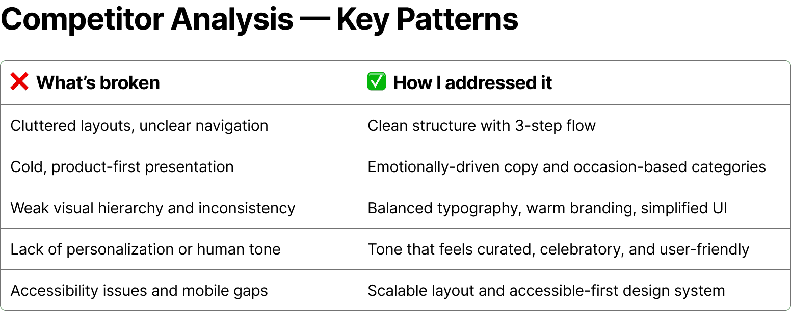
Existing platforms in the custom gifting space often fall short. Some, like Marigold & Grey, suffer from low accessibility and cluttered layouts. Others, such as Fox Blossom, rely heavily on product visuals but lack emotional warmth or user guidance. Across the board, navigation feels transactional rather than personal — leaving space for a more curated, human-centered approach.

#context —
Approach
Instead of deep user research, I focused on a compact competitive analysis to understand market gaps and expectations. I reviewed two direct competitors and interpreted the target audience through their content and tone. Combined with the brief, this gave a clear direction for structure, messaging, and visual design.
#context —
#research —
Design is about trust, not decoration
#manifest —
Inspiration
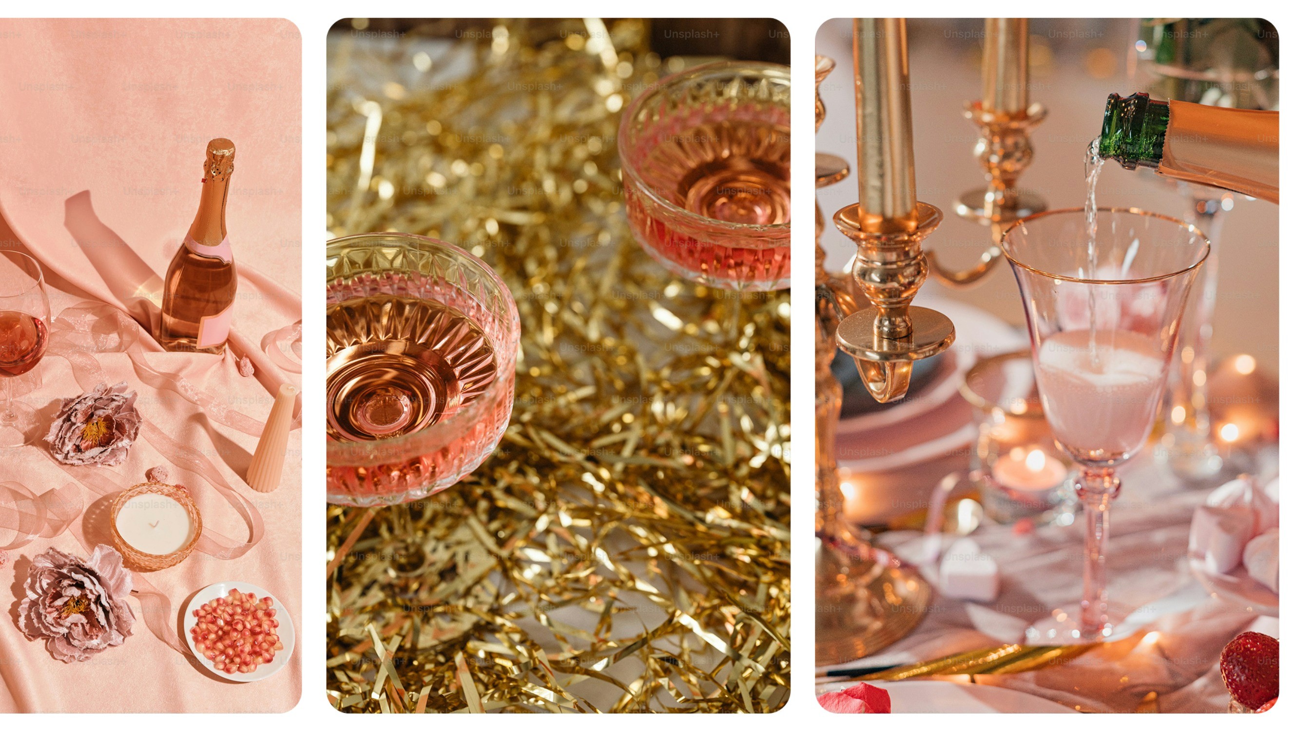
The visual direction was inspired by the idea of “a birthday morning in a high-design home” — think soft marble textures, natural light, and just a hint of champagne. The goal was to create a brand feel that’s elevated yet warm: premium, but not distant.
Key elements
Palette:
soft pastels with confident accent tones
Typography:
clean, elegant type with subtle character
Forms:
rounded edges and airy layouts for a sense of ease
Mood:
calm, modern, and emotionally inviting

#ideate —
UX/UI Design
Core UX decisions
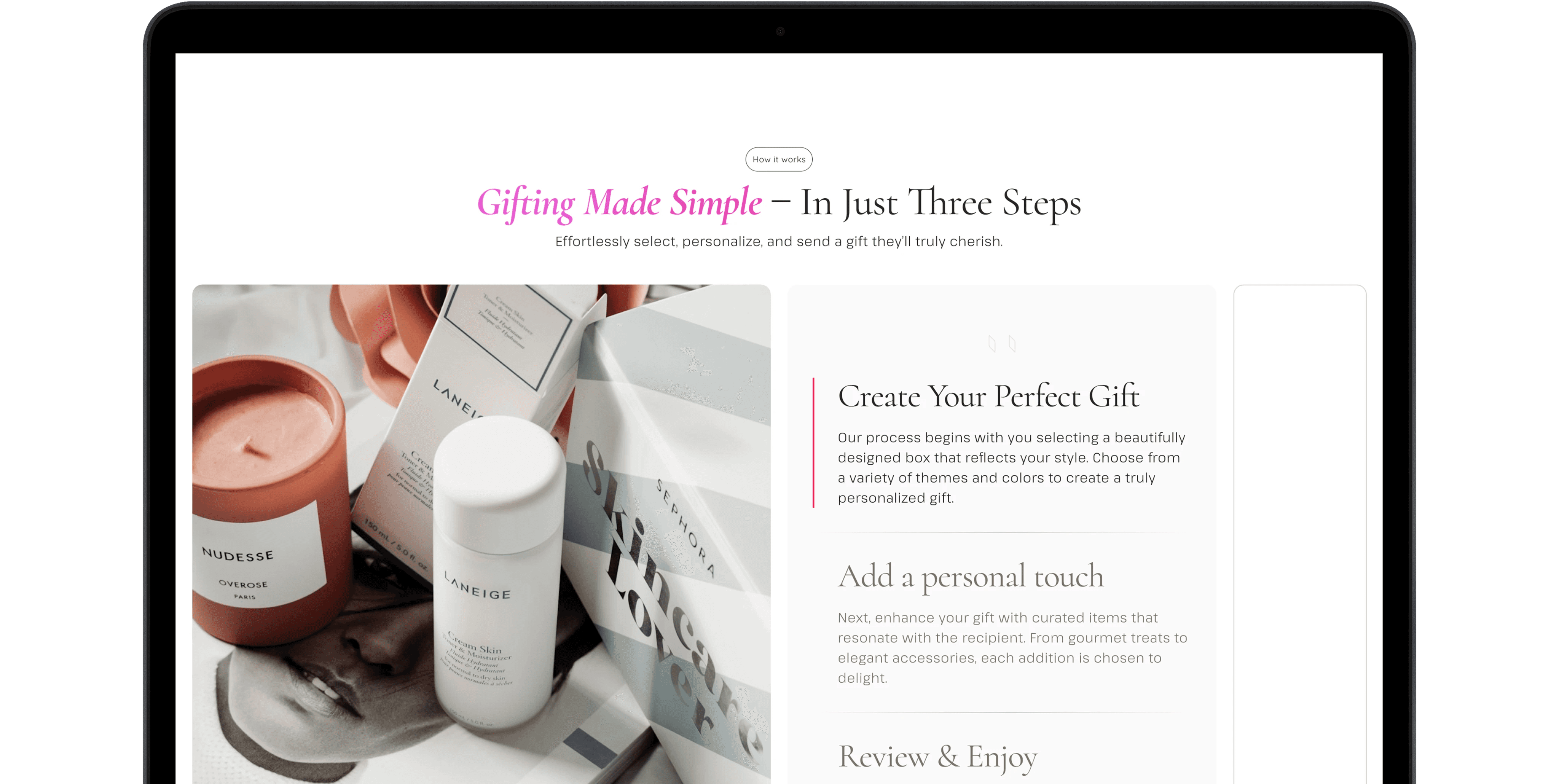
To streamline the experience, I structured the flow around three intuitive steps: select a gift, customize it, and place the order.
Navigation was organized around real-life occasions — not product types — helping users find what feels right faster and with less friction.
What was delivered
✨Clear, occasion-based navigation
✨ Emotionally-driven copy and layout
✨ Fully branded UI with a consistent visual language
✨ Mobile adaptability planned, with scalable design structure
✖️ Development was paused before implementation
The design feels personal, modern, and easy to engage with — giving users a sense of care from the very first click.
Design Stack
The entire project was built in Figma, with visual exploration and branding direction developed in Illustrator.
Content and visuals were generated using AI tools such as ChatGPT, Sora, and Stable Diffusion, allowing full independence in the creative process.


#context —
#rfinals —
Reflections
This wasn’t just about building an app — it taught me how to think like a product designer.
#context —
#reflections —
This project taught me the value of restraint in visual design and how emotional UX goes beyond aesthetics — it's about tone, rhythm, and clarity. I also saw how strong branding can support (or overwhelm) usability, and how every UI element needs to earn its place.
Looking back, I would reduce visual saturation and give more breathing room to the interface. Some branding elements, while strong, competed with the core UX — next time, I’d let the product speak louder than the wrapper. I’d also expand the early research phase and test concepts sooner, even with basic prototypes.