
Capstone project
Google UX Certification
#hero —
#nav-trigger-1 —
Table of contents
🟢 Impact
Enhanced plant care management for experienced users through real-time verification and group scheduling.
🟡 Challenge
Existing apps failed to address advanced needs like bulk editing, data accuracy, and accessibility.
🟠 Subject
A mobile app designed to help plant enthusiasts manage their collections more intuitively and reliably.
#TLDR —
Context
Why this project?
This app was my capstone project for the Google UX Design Certificate.
It started with a simple idea: help plant owners care for their collections more effectively.
But early exploration quickly revealed deeper problems:
Most existing apps are built for casual users.
There’s little support for advanced needs like managing large plant groups, verifying care information, or personalizing the interface.
Accessibility is often overlooked entirely.
#context —
Given the limited scope of this student project, I started with lightweight methods that could still yield actionable insights.
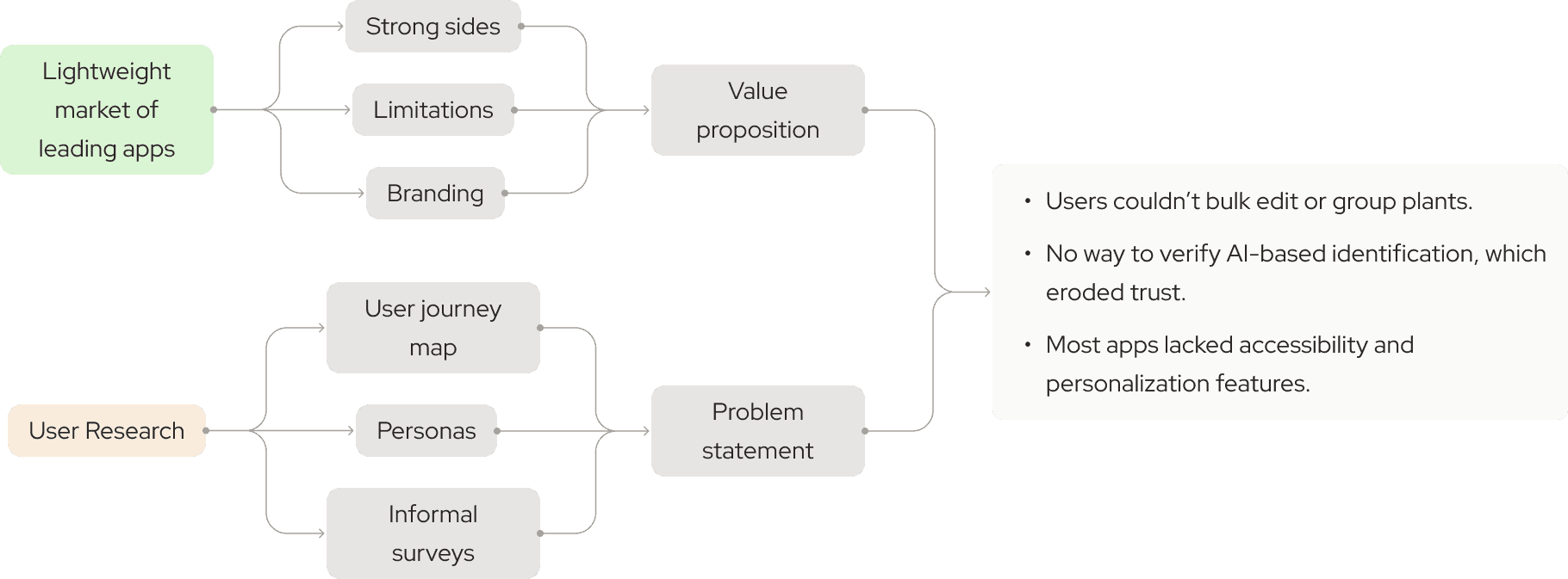
#context —
#research —
Clarity isn’t just about UI — it’s about assumptions.
#manifest —
Testing the First Prototype
I built a low-fidelity prototype and ran an unmoderated usability study using Useberry, with 7 real users which shows SUS of 61. The test combined:
Heatmaps
Interaction flows
Post-task survey questions
This allowed me to validate early assumptions quickly and cheaply — and it paid off.
Key insight
“This flow only makes sense if you’ve already used plant care apps.”
For many users, the original navigation felt too abstract. Actions that felt natural to me as a designer weren’t intuitive to new users. This led to one of the most important shifts in the project:
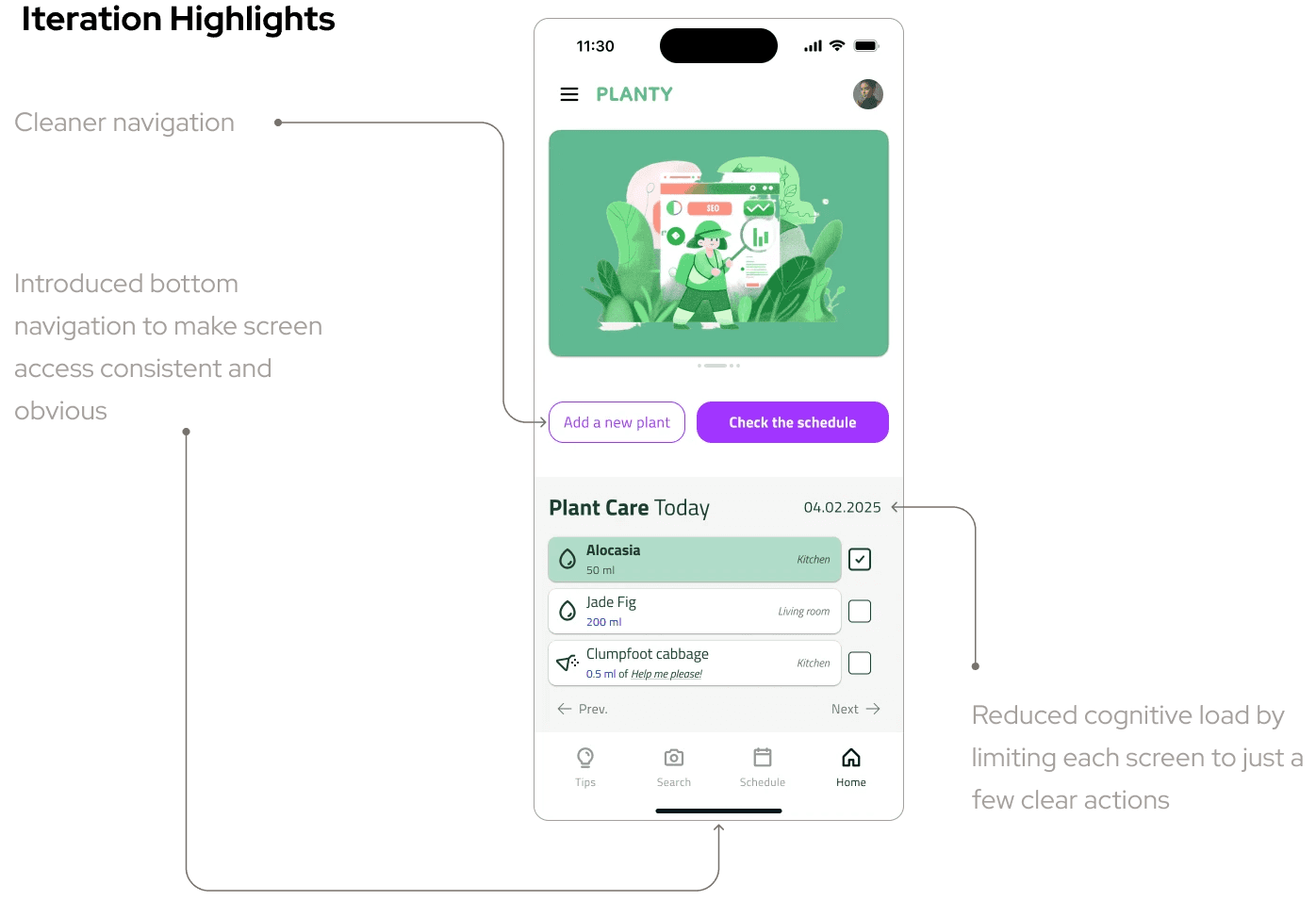
These changes improved clarity without adding complexity — and made the experience more universal.
#ideate —
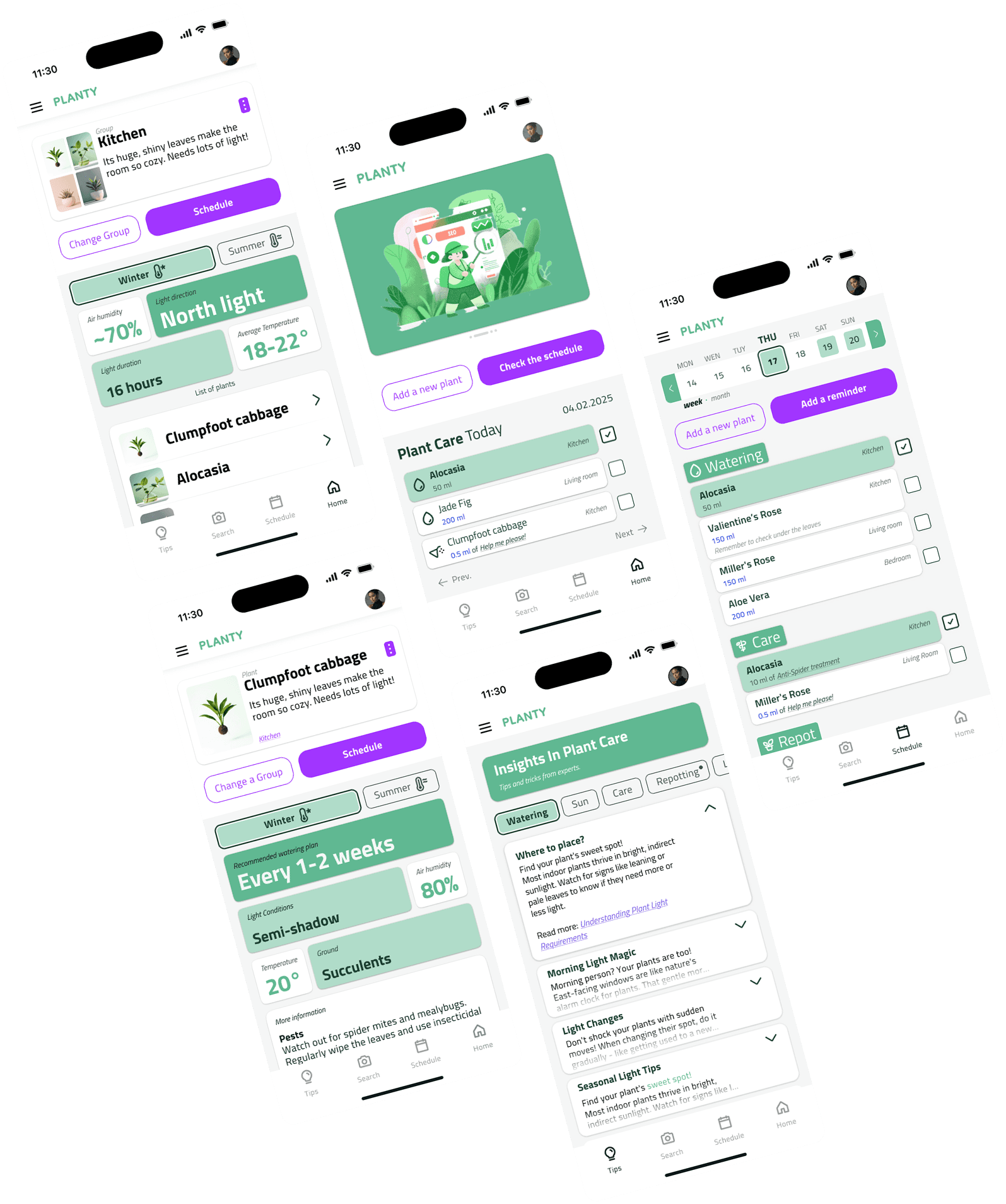
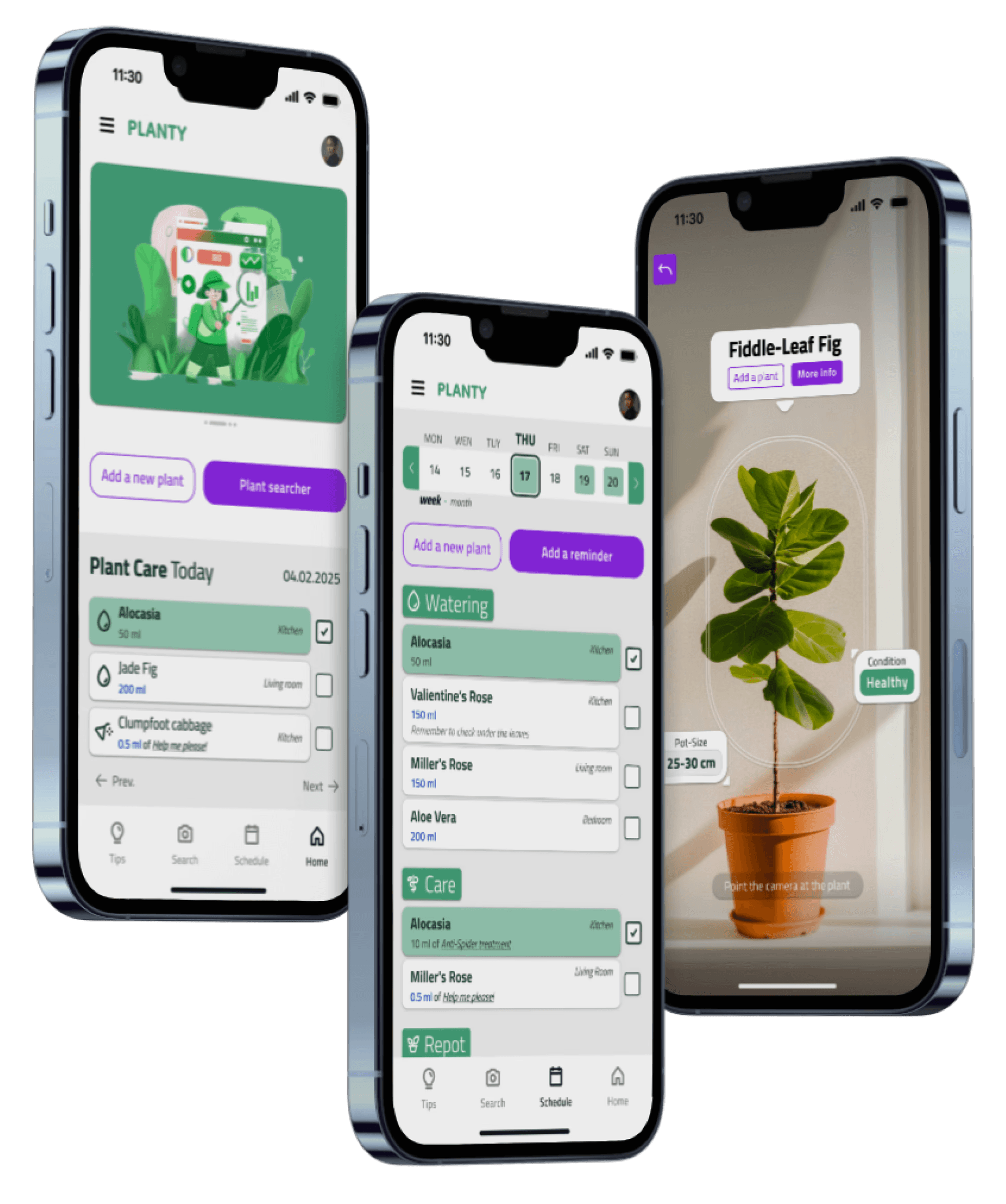
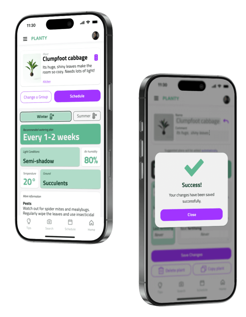
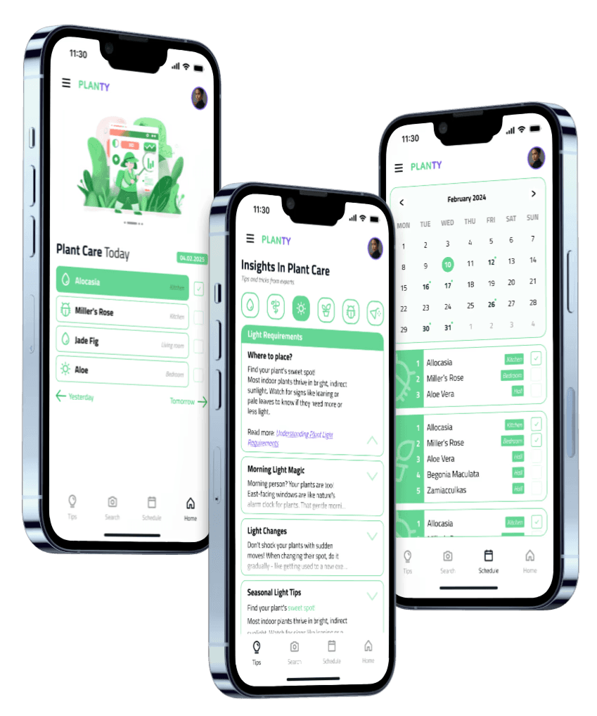
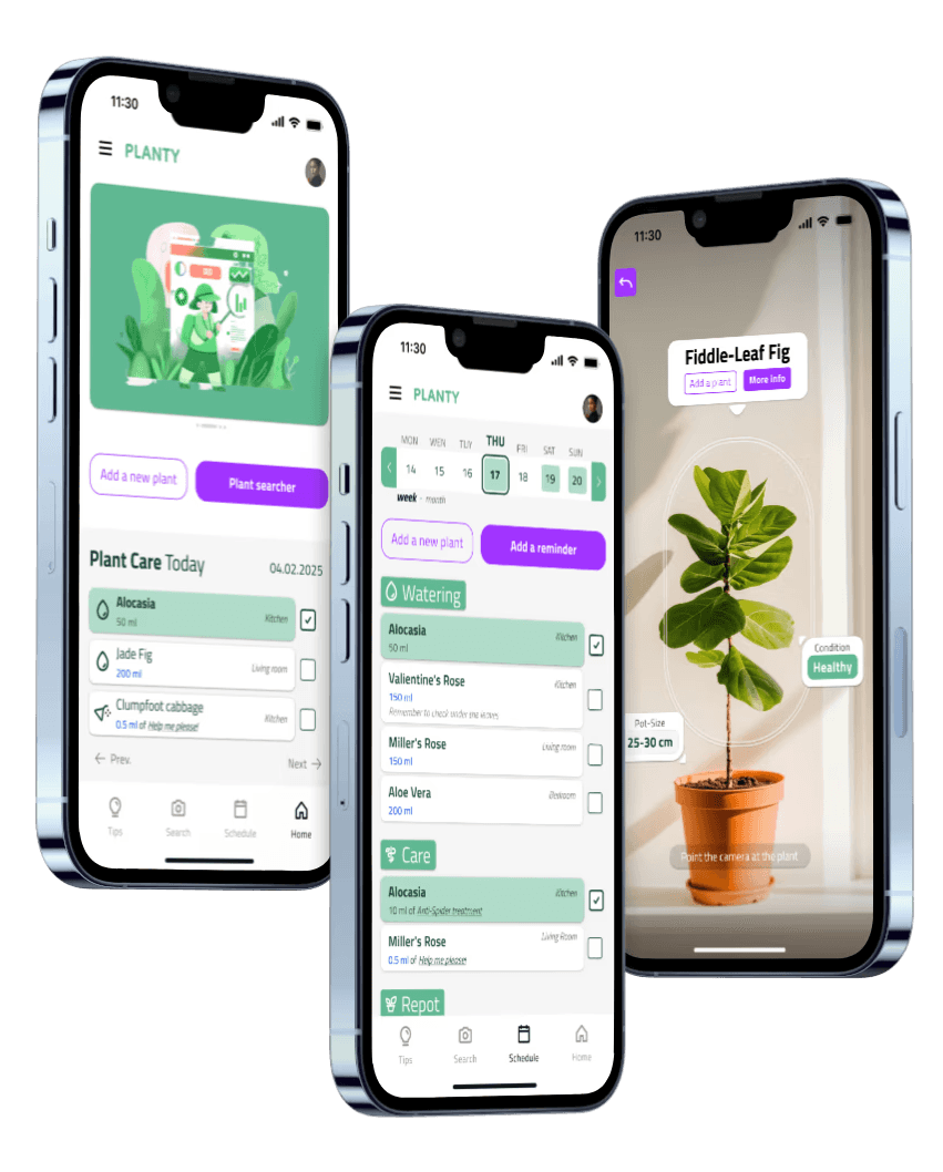
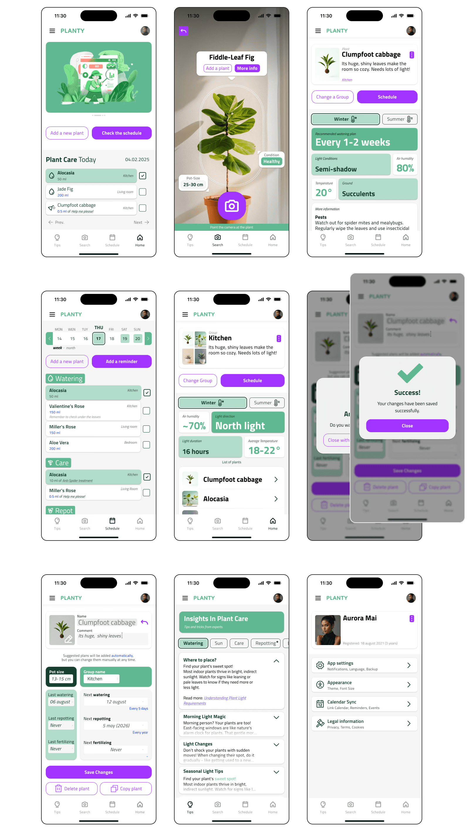
Final Design & Features
Main features
Bulk Editing for Plant Groups
Users can organize plants into care groups and apply reminders or changes to multiple entries at once — a rare feature in this category.
Verified Information for AI Recognition
Instead of trusting AI blindly, users can manually confirm or correct plant identification — especially important for rare or toxic species.
Personalized Appearance Settings
Including dark/light mode, readable fonts, and adjustable text sizes — fully aligned with WCAG 2.0 accessibility guidelines.
Calendar Integration
Native sync with Google Calendar for plant care reminders, helping users plan and stay consistent.
Simplified Navigation Flow
Reduced visual noise and minimized screen actions — based on actual user behavior and accessibility best practices.
Iteration I
Iteration II


#context —
#rfinals —
Reflections
This wasn’t just about building an app — it taught me how to think like a product designer.
#context —
#reflections —
Using constraints to guide decisions — especially when scoping features.
Prioritizing accessibility over visual complexity.
Applying component logic early, inspired by Fluent 2.
No more shadows — that was the last time I used them in mobile UI.
Too much color in early screens — it clashed with clarity and accessibility goals.
Skimming over foundational structure — made prototyping harder than it needed to be.
Simplify visuals from the start.
Spend less time on templates, more on real research.
Build with a clear system of states, layouts, and tokens.
Add better onboarding for new users.